

No matter what you’ve heard about its declining popularity, Facebook is still the most-used social media platform in the world with roughly 2.93 billion monthly active users worldwide. This means that if you run ads on Facebook, you have the chance to reach a boatload of people.
In fact, research shows that Facebook ads reach 42.8% of all Internet users. Who wouldn’t want that?
But advertising on Facebook is not just about reach. The platform offers marketers the ability to set up the most advanced campaigns on social within its Ads Manager. From building custom audiences and targeting very specific demographics to running A/B tests, Facebook gives social media marketers full control over their ad campaigns, no matter the size.

If you already know how to run ads on Facebook and the various ad formats you can use, this guide will give you some fresh ideas for your next ad campaign.
Keep reading for 15 fresh examples of top-tier Facebook ads (for different ad types) and actionable takeaways you can implement in your ads.
Facebook image ads examples
1. Nike
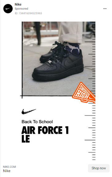
Nike is one of the most popular shoe brands in the world. In this ad, they’re marketing their new Air Force 1 Le shoes as part of their Back to School ad campaign.
What can you learn from this ad?
- Keep it simple. The white background forms a perfect contrast with the jet-black color of the shoes and the orange pop of color at the side of the ad.
- Be product-centric. In this ad, Nike let their product feature speak for itself. Apart from the simple copy on the ad (the name of the campaign and the product), Nike does not add any other copy. Instead, they let their customers decide whether to purchase the shoe or not based on the high-quality picture of it in the ad.
2. Spotify
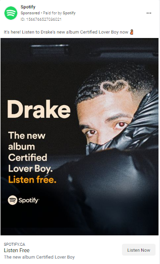
In this ad, streaming platform Spotify is advertising Drake’s new album, Certified Lover Boy.
What can you learn from this ad?
- Use bold backgrounds. White backgrounds are great for ads, but to create intensity and grab people’s attention, you can use a dark background and balance it up with lighter-colored text, like Spotify does in this ad.
- Use power words. In this ad, Spotify’s power word is “free”. In the image itself, Spotify says, “Listen free”. And the caption says, “Listen to Drake’s new album Certified Lover Boy now.” The operative word “now” creates a sense of urgency and FOMO in people that prompts them to click the ad.
3. Shopify
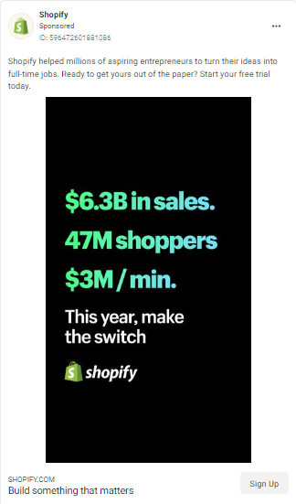
Shopify is the most popular e-commerce platform in the market right now. In this ad, Shopify is trying to convince people to sign up to their platform and start their own business.
- Make powerful promises. In the caption, Shopify noted that it has helped “millions of entrepreneurs turn their ideas into full-time jobs.” This is powerful because they’re looking for people who want to turn their business ideas into reality.
- Use hard numbers. Shopify goes further to provide hard numbers that complement their caption. According to them, Shopify has generated over $6 billion in sales, and $3 million every minute for entrepreneurs that use their platform. If that doesn’t convince you that Shopify’s the real deal, I don’t know what will.
- Use scroll-stopping graphics. Spot that jet-black background and neon-colored text. This combination grabs the attention of a prospect and keeps it.
4. PayPal
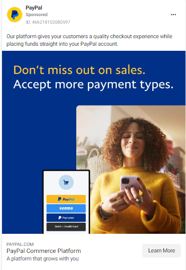
PayPal is a wildly popular payment gateway that individuals and businesses use to make and receive payments. In this ad, PayPal is showing people that their platform has expanded to support more payment types.
- Tell people what you can do for them. In this ad’s caption, PayPal clearly tells prospects what their platform can do for them–“give your customers a quality checkout experience while placing funds straight into your PayPal account”. It’s that simple.
- Use complementary colors. The blue background in the ad complements the yellow hues of the model’s sweater and the PayPal demo image.
- Use a powerful tagline. At the bottom of the ad, PayPal is referred to as “a platform that grows with you”. This signals to business owners that they can trust PayPal to cater to their needs no matter how big or how fast their businesses grow.
5. Salesforce
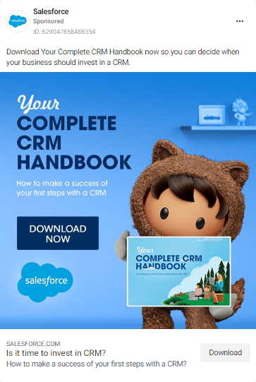
In this ad, Customer Relationship Management (CRM) tool Salesforce is advertising their new CRM handbook.
What can you learn from this ad?
- Go monotone. Apart from the illustrated character and some text in the image, Salesforce used different shades of the color blue to design the visual. These shades of blue complement the brown-colored character well.
- State your value proposition. In the caption and under the bold heading in the ad, Salesforce promises people that their CRM handbook will help them determine when their businesses need a CRM and how to be successful the first time they invest in a CRM tool.
Facebook carousel ads examples
6. Sephora
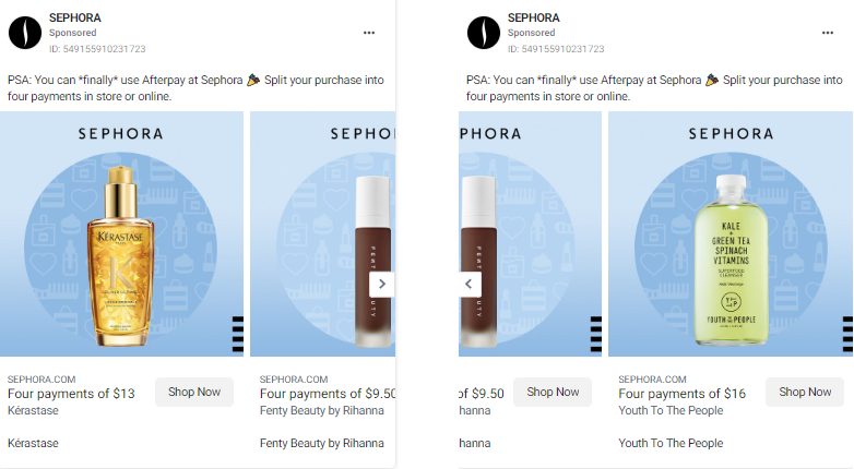
In this carousel ad, popular beauty retail store Sephora is showing people that they can use Afterpay when they shop at Sephora.
What can you learn from this ad?
- Appeal to people with buzzwords. In the ad caption, Sephora says that people “can *finally* use Afterpay at Sephora”. The buzzword, finally, denotes that many people have been requesting that Sephora make Afterpay available at their stores. Now that it’s available, Sephora is appealing to people who have been requesting this feature for a long time.
- Focus on products one at a time. Carousel ads allow you to add several images in one ad. Rather than jamming all your products into one image, you, like Sephora, can use each image space to focus on a single product.
7. Dell
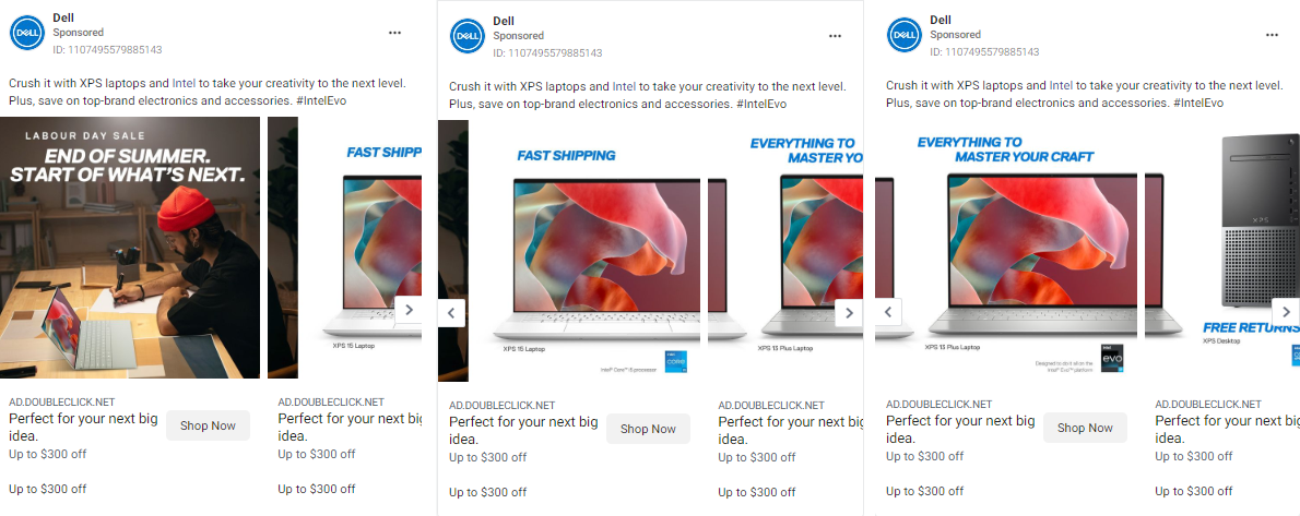
In this ad, Dell is urging people to take advantage of Labour Day discounts on electronics and accessories, with a focus on XPS laptops and Intel.
What can you learn from this ad?
- Split the product image. Notice how in slides 2 and 3, Dell split the product image over two slides. This compels the viewers to swipe left to see the other parts of the laptop. This method works well for products that take up a lot of horizontal space.
- Focus on one benefit per image. Notice how Dell focuses on one benefit of the product per image, e.g. Fast Shipping, Fast Returns, and more.
- Have a juicy offer. For this Labour Day sale, Dell is offering up to $300 off on electronics and accessories. That’s a huge discount that anyone would want to take advantage of. Limited-time offers work great in this context too!
8. Cider
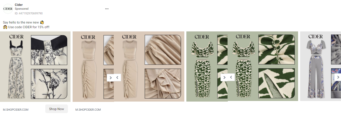
In this ad, clothing brand Cider is advertising its new outfits.
What can you learn from this ad?
- Give discounts. In this ad, Cider gives potential shoppers 15% off if they use their special code. This discount is an incentive that prompts people to buy.
- Prove your product’s quality. In each slide, Cider includes a full-length image of the outfit as well as close-ups so that people can see the quality of the material and design. Let other people see how good your product is.
9. Bayrite
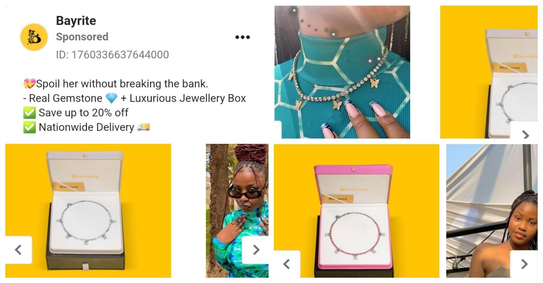
In this ad, jewelry company Bayrite is advertising their new necklace.
What can you learn from this ad?
- Show off your product variations. Bayrite’s necklace comes in three colors—gold, silver, and pink. Notice how they didn’t put one picture of the necklace with the caption, “Available in gold, silver, and pink”. Instead they showed pictures of all three variations of the product, as well as what the necklaces look like when actual people wear them.
- Incite interest. Part of Bayrite’s caption of this ad reads, “❤️Spoil her without breaking the bank”. It makes sense to assume that Bayrite is targeting people who want to get something nice for their partners, but are working with a tight budget.
Not only is Bayrite saying that their product is affordable, but they’re also giving a 20% discount for people who purchase the necklace. Way to go!
10. Yoga International
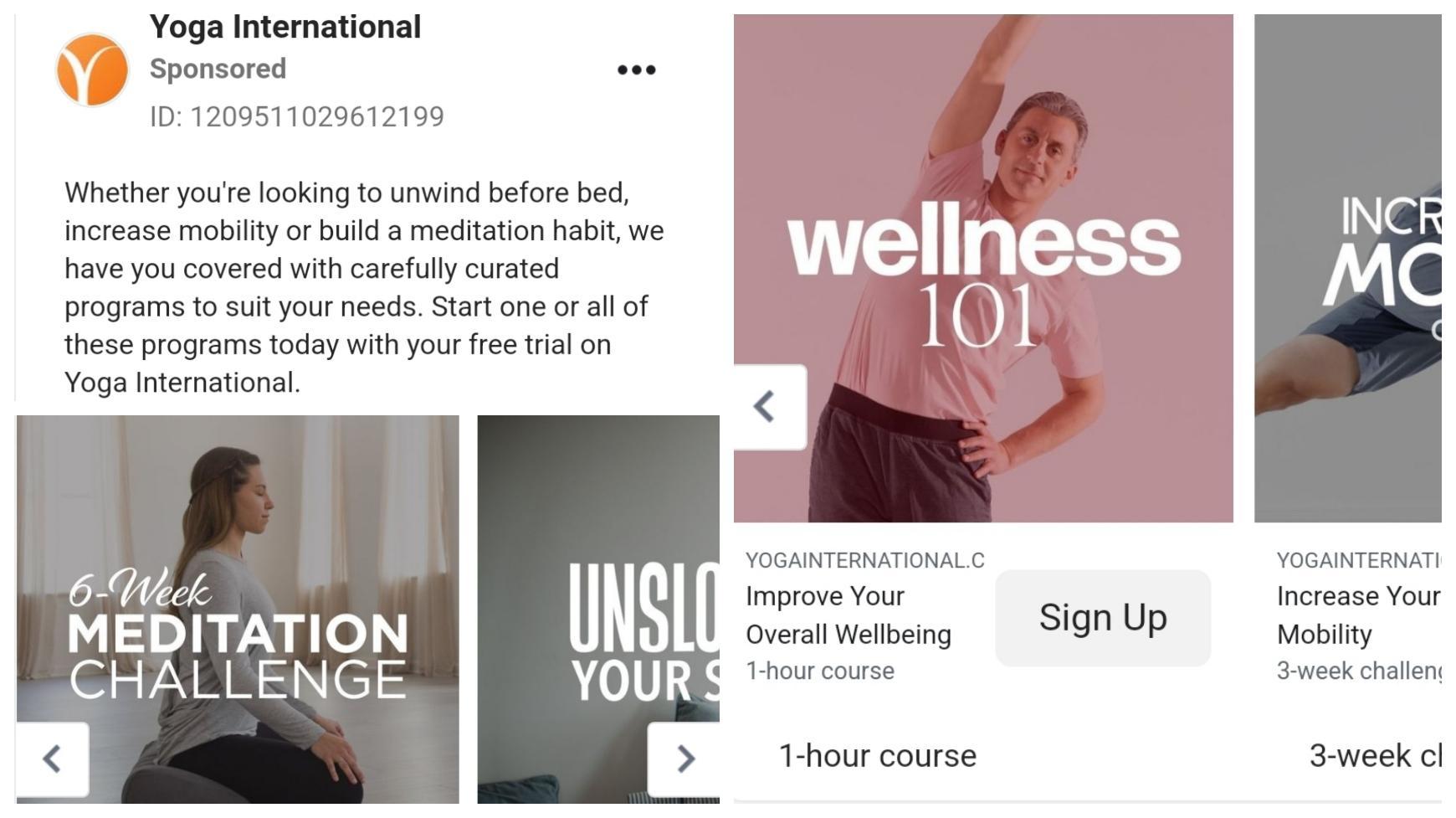
In this ad, fitness company Yoga International is urging people to sign up to their app to crush their fitness goals.
What can you learn from this ad?
- Present your product as the ultimate solution (if it is). In this ad, Yoga International presents their fitness programs as an all-in-one solution that can help people achieve their fitness goals—whether it’s general wellness, increasing mobility, or developing a meditation habit.
- If possible, give prospects a time frame at which they can achieve their goals. Under each slide, Yoga International gives prospects a timeframe for each fitness goal. For wellness, they’ll get a 1-hour course. For mobility, they’ll participate in a 3-week fitness challenge. This gives people something to expect when they sign up.
Facebook Stories ad examples
11. Udemy
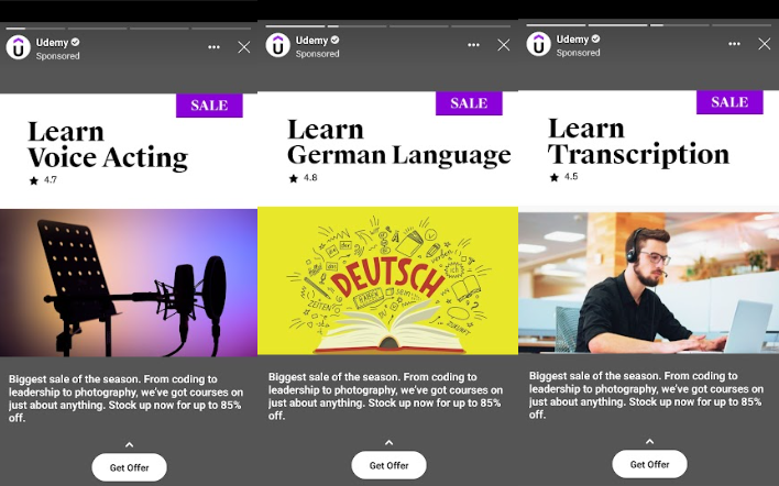
In this ad, popular course platform Udemy is advertising courses.
What can you learn from this ad?
- Focus on one thing at a time. Instead of jamming all three courses into one slide, Udemy uses each slide to focus on a particular course. If you have many offers, consider using this approach to avoid overwhelming viewers.
- Use complementary images. Notice how an image of a microphone set-up was used on the slide for voice acting, the word “Deutsch” was used for the German language course, and a picture of someone typing with headphones on for the transcription course. These images complement the offers really well, and can help viewers envision what they’ll be doing should they decide to take one (or more) of the courses.
- Make your incentive irresistible. Here, Udemy assures people that they can pick any course on any topic of their choice for up to 85% off. That’s over two-thirds of the original prices of the courses!
12. Authority Hacker

In this ad, Authority Hacker is advertising their new course on how to build and rank websites.
What can you learn from this ad?
- Slow down with the visuals. This ad is simple and text-based. There are no scruffy images or overly-bright colors. It’s mellow, but the gradient/dotted design in the middle really captures people’s attention.
- Make your incentive the focus. Authority Hacker knows that anyone can create and advertise courses. So to pique people’s interests, they focused the ad on the incentive—$400. The yellow text against the black and blue backgrounds really makes the incentive pop.
- Create a feeling of urgency. The prospect of getting a course at $400 should be enough to get people to convert. But with the line, “Time is running out…”, Authority Hacker goes further by making people feel like this is an offer they’ll never get again if they don’t hurry.
13. Coursera
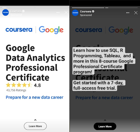
Here, another popular e-learning platform, Coursera, is promoting their Google Analytics Certificate course.
What can you learn in this ad?
- Use social proof. Coursera knows that there are many Google Analytics courses out there. To show people that their course is worth it, Coursera adds the course’s 4.8/5 star rating (43,756 ratings). This shows that people who have taken the course loved it and think it is worth it.
- Leave the caption for the next slide. To avoid overlaying text on the ad, Coursera added their caption in the next slide. This captions offers people a full access free trial for 7 days.
14. Bolt Food
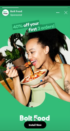
In this ad, Bolt Food is offering people an incentive to install their app.
What can you learn from this ad?
- Show, don’t tell. As one may guess from the name, Bolt Food is a business that relates to… well, food. But instead of explicitly stating that they deliver food, Bolt Food used the image of a woman eating a delicious-looking salad. This immediately tells the viewer that this is a food-related ad.
- Focus on the incentive. Just like Authority Hacker, Bolt Food doesn’t spend too much effort pitching themselves. Instead, they rely on their generous “40% off your first 3 orders” incentive to convince people to install their app.
15. IDP Nigeria
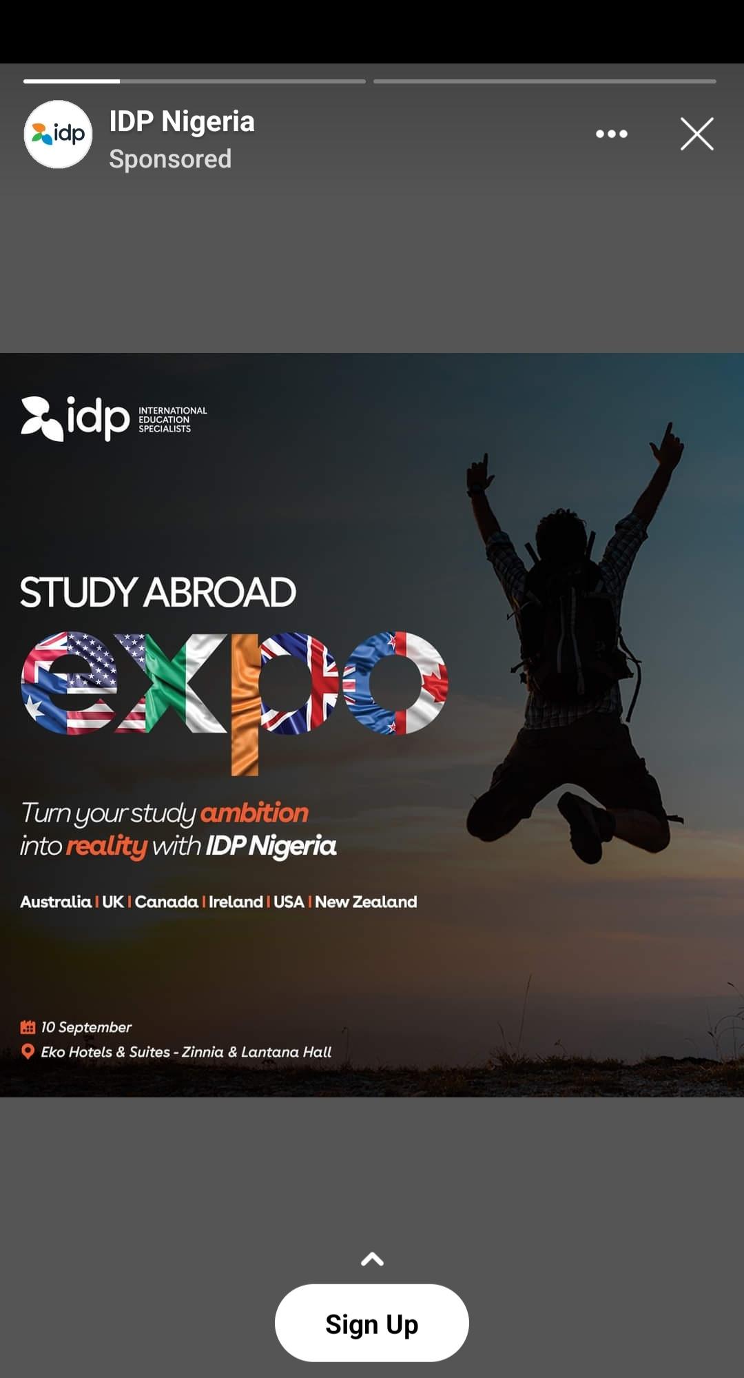
In this ad, international education experts IDP Nigeria are urging people who want to study abroad to sign up for their talk.
What can we learn from this ad?
- Ad creatives should be… creative. In this ad, IDP combined a dark, gradient-like background with an image of a man jumping in the air. That image denotes freedom, which is what IDP is about at its core: helping students from Nigeria, in this case, study in any of the aforementioned countries without a hitch. Speaking of countries, IDP not only mentioned the six countries students can study in with their help, but they also used the flags of said countries to design the “expo” part of the ad. Talk about creativity!
- Be clear about your CTA. In this ad, IDP didn’t just ask people to sign up for their expo. They also provided the date and location of the talk in the ad. This ensures that people who sign up have space in their calendars and are likely to attend the event.
What makes a great Facebook ad?
When you take a good look at the examples outlined above, you might notice some ad design elements and copywriting tactics that can help you advertise on Facebook effectively.
We have summed them up below as a couple of best practices you can incorporate into your next Facebook ads campaign.
Scroll-stopping visuals
It’s no secret that social media users have short attention spans. So to grab their attention and keep it, your ad visuals have to be unique.
You can improve the quality of your ad visuals by:
- Reducing the amount of text on images. Facebook recommends that you use text on less than 20% of your design.
- Keep videos short and concise (15 seconds or less).
- Add a moving visual to catch a user’s attention mid-scroll. This works well with GIFs or video ads.
- Tell stories. They help users stick around to watch your ads till the end.
Short and to-the-point copy
If you look at the ad captions of the ad examples above, you’ll realize that most of them are 1-2 sentences long.
As we mentioned earlier, social media users have short attention spans, especially if they’re using mobile devices to view ads. So go straight to the point.
If your ad caption is over 3 sentences long, put the hook in the first 1-2 sentences, above the fold. But remember, the shorter the better.
Mobile-friendly design
Nearly 99% of users scroll through their Facebook feeds via a mobile device. So when designing your ads, keep mobile devices in mind. Here are some ways to optimize your ads to be mobile-friendly:
- Grab the user’s attention within the first 3 seconds of your video.
- Use vertical images and/or videos, as they take up more space on mobile screens.
- Use captions and/or overlay text so that viewers can know what your ad is about without turning on sound.
- Show your brand, product, or service very early in the video ads, just in case viewers don’t watch the ad till the end.
Compelling CTAs
The call-to-action (CTA) is the most important part of an ad. It shows what you want viewers to do after seeing your ad, e.g. sign up to your product, learn more about your offer, etc.
Here are some ways to optimize your CTA:
- Match your CTA to the success metric of your ad campaign. If you want to collect emails, tell people to sign up for your newsletter. If you want more freemium customers, tell people to sign up for a free trial of your product.
- Make your CTA specific. Many of the ads above have generic “Learn more” CTAs. You can go beyond that. Facebook has 20+ CTA button options you can choose from.
- Use A/B testing to determine the CTA that converts best for your ads.
Audience research and thoughtful targeting
The last thing you want to do is send your ad for streetwear to people who are looking to buy corporate outfits. They won’t convert.
Instead, you want to send your ads to people who are looking for what you are offering. These people are more likely to engage with your ads and convert.
Here are some tips on how to tailor your Facebook ads to your target audience:
- Use different ad sets to create various visuals for each audience segment.
- Craft your ads’ messaging based on your target audience (their age, location, interests, stage of the sales funnel they’re on, etc.)
Are you ready to start creating an ad campaign? Before you start designing, check out our guide to all Facebook ad image sizes and Hootsuite’s guide to the top Facebook trends in 2022.
Plan, monitor, and analyze organic and paid Facebook campaigns from a single, intuitive dashboard with Hootsuite Social Advertising. See how it works. Try Hootsuite for free today.